


Infographic Video Maker: put your Company's Story in Motion

Whatever your market is, if you want to use an infographic video maker to tell your company's story, here are some options for your infographic video..
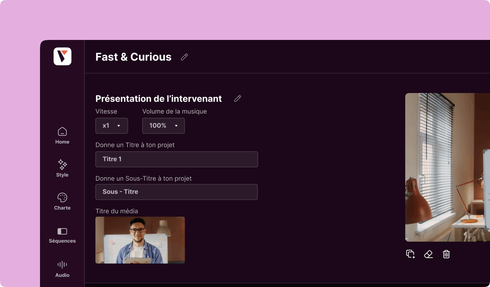
Infographic video maker is becoming increasingly popular with companies (from any business) wishing to create quality motion design videos and compile a complex set of elements, information or data (statistics in the forms of graphs, diagrams and charts) and put it into images, animations, voiceovers, text and templates, thanks to beautiful infographics. Very often, when a brand presents itself for the first time, it likes to do what is called storytelling: tell its story. And what better way to illustrate the passing of time and the evolution of a company than with video, and more specifically with animated infographics? It will be much more powerful than a static infographic, and will serve as a visual narrative.
Precisely, to represent this famous passing of time (this timeline) in a few minutes or seconds, there are several animations for your infographic. We have listed some of these animations here to give the best experience to viewers and users of your future presentations.
For example, you can represent time in linear ways with infographic video maker
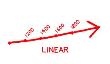
In our culture, the conception of time, like that of life, is linear, i.e. it is presented as a straight line, with a beginning (birth), and an end (death). The linear curve is therefore the most commonly accepted form in our societies, easy to understand, with a starting point, which will be the year of creation of your company, or of invention of your service/concept. Then move the curve forward in time, marking with a dot/flag the significant years for your company: IPO, increasing number of employees, new important team members, IPO, etc…
Represent time as a circle
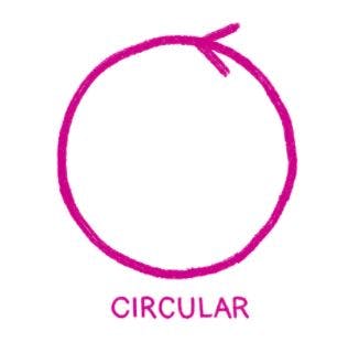
In contrast, in other cultures, the vision of time is not linear, but circular. This is probably related to the concept of day and night, which follow one another eternally. You can use this type of infographic, for example, if you want to show that history repeats itself, or that you have achieved all your goals over time.
This template can also be used if you have redundant events, such as conferences that you attend every year. Your events team can then consider each one as a milestone in the current year.
Indeed, this circular concept of time can also refer to the Earth’s revolution around the Sun, corresponding to a whole year.
Seeing the repetition of facts as loops
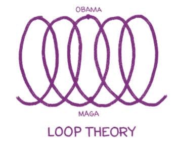
At first glance, it may seem strange to represent the passage of time, or the evolution of time, in loops. In the graph above, Obama’s name is no accident. In his inaugural speech in 2009, he compared his victory to a series of advances and setbacks in his life, but also in American society.
Representing time in this way can show how your society has had to overcome many obstacles during its existence, and how these advances and setbacks have enabled it to reach the ultimate goals, represented by the peaks of each loop.
The temporal “big bang”
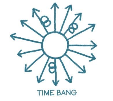
The principle is simple: have a basic event, and several possible hypotheses, probable consequences due to this original event, like the Big Bang that created the universe. In concrete terms, in computer graphics, what does this mean? Your animation will start with a central point, i.e. the original event, and the animation will then scroll through a multitude of lines going in opposite directions (thus forming a kind of Sun).
This concept of time can be used, not to tell your past story, but to tell the future. Depending on your decisions, there may be many consequences. Presenting things in this way will allow your team to see the range of possibilities.
Time in a spiral

If you work in a company or group with an older, more complex, obstacle-filled history, you can illustrate this in a rather funny way, using the spiral animation. As with the loop infographic, each loop can represent the difficulties you have encountered, your downfalls, your failures, your doubts. But your spiral must keep moving forward in a spiral. At the beginning, we only see a sort of rosette, symbolising your beginnings, the genesis of the project or the company. Then, the loops continue to form around it, ad infinitum.
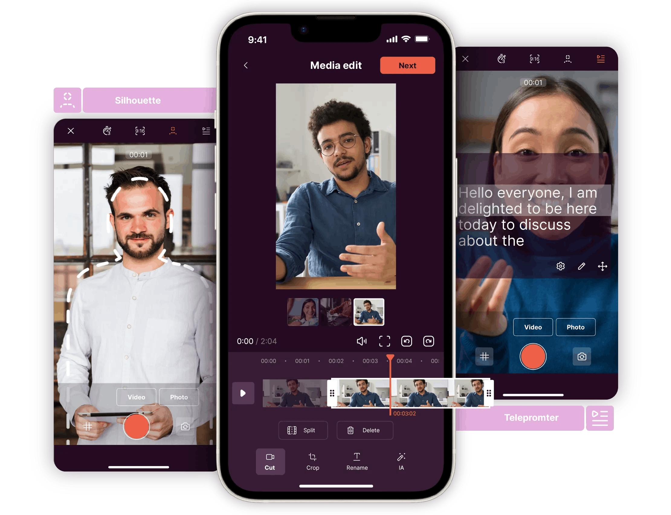
Would you like to create your own computer graphics to illustrate your company’s history in animation? No need to go through an agency. Ask for a demo of the Pitchy solution.
– Decoding: The challenges of corporate communications
– Trends: Corporate communications formats and themes
– Strategy: 5 ways to use video to reinvent your corporate communications
– Complete demo
– Examples of customer video creations
– Offers and prices
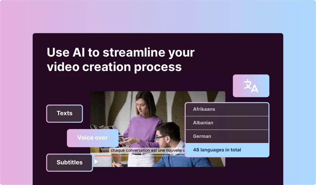
Would you like to create and edit your own computer graphics to illustrate your company’s history in animation (through charts) to your audience (teams or even customers)? Different than most tools? No need to go through an agency. Ask for a demo of the Pitchy solution. A simple tool for professional infographic templates (for non-designers), with infographic design inspiration, one of the best infographic makers for your audience and for your social media, approved by hundreds of companies. Ask for infographic examples.

A passionate Content Manager at Pitchy, Marc excels in designing and implementing captivating strategies, combining hard-hitting writing and in-depth analysis to bring you the best information!
Resources